Saturday 30 March 2013

Sleek i-Divine Ultra Mattes v2 Palette swatches. (Darks)


Hey everyone! - I was scouring my local Superdrug for a different product entirely as I'd heard of Sleek releasing yet another limited edition palette called "Lagoon"..well..when I finally found the thing,I was sadly disappointed by what I saw.There I was,swatching away.I took a swatch of the gold..no payoff.No matter,there's always a dud shade,right? Wrong.I kept on swatching and only found about four colours with any GOOD freakin' pigment! I wasn't prepared to spend out on something which wasn't all that pleasing.I wondered whether I'd just gotten a bad tester palette - no idea!

It was a real shame,as that palette appeared to be really summery and pretty.

So instead,I got this palette,the Ultra Mattes v2,featuring a multitude of gorgeous,smokey dark shades!!


Featured in the typical Sleek black box packaging,the palette comes with a double-ended sponge tipped applicator and a product card.As you can see from below,the palette also sports a massive mirror.Again,my only nag with any of the Sleek i-Divine's is the lack of labelling - these come with an annoying plastic overlay with each shadow's name instead of a print (Pictured in the mirror below)

Left to Right.
Top : Orbit,Ink,Highness,Noir,Dune,Pillow Talk.
Bottom : Thunder,Maple,Flesh,Paper Bag,Villain,Fern.


Orbit,Ink,Highness,Noir,Dune,Pillow Talk.    


                                                            Thunder,Maple,Flesh,Paper Bag,Villain,Fern.    

The colours are sensational.Beautiful rich darks and a couple of autumnal inspired lighter colours,like Maple and Flesh.There is however,one dud colour - "Dune" was not as pleasing in pigment concentration.Either way,I couldn't complain for the price,as I'm very happy with the other shades in this palette.Orbit,Fern and Highness are definite favourites! 

I'm thinking about trying the Ultra Mattes v1 - Brights,what do you think of this palette?

x ~ x
                                                                   

Sunday 24 March 2013

ELF Jumbo Eyeshadow Sticks.

Hey everybody! Today I'm hitting you with another review,to correspond with my latest Youtube video - Saints & Sinners of ELF!


I bought these Eyeshadow Sticks a couple of weeks back and have been testing them to find out how good they really are.Keep reading for my review.

The 3 colours that I decided on,from the choice of 10 shades were : 

- Bali Bound : A rich emerald green

- French Lace : A nude with gold glitter.

- Check Me Out : A deep purple with pink glitz.

The sticks are twistable which is fairly convenient.I always feel slightly cheated by companies that make chubby sticks needing to be sharpened - it just wastes product! I really like the white packaging with the coloured ends.Makes it easier to grab the right shade in a rush.


The pigment of these sticks are good.Very rich and creamy,and I'm in love with how opaque French Lace is.The only problem I could detect from these was how much they crease without a primer.For £2.50 though,I'm not sure I can complain when they crease within 2 hours,especially for how much product you're getting..You'd have to use a good base like Urban Decay's Primer Potion to make these stay in place.

These colours blend out really nicely,and can be used as a liner,smudged out. (Though steer clear of the waterline,they won't stick!)


Left to Right - French Lace,Bali Bound & Check Me Out.

Overall I like these very much - They're definitely one of ELF's better products.

Have you tried these out? What did you think? 

x ~ x

Tuesday 19 March 2013

Concrete Minerals Swatches & Overview.

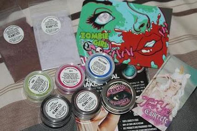
Hey everybody! I got a package in the post this morning and was way too excited to wait and do a video (which I'm still contemplating.) - My Concrete Minerals products arrived!


I figured I may as well do a little swatchy-swatchy and an review,so without further ado,onto the gorgeous pigments.

Starting off,the packaging is simple yet eye catching.Each little pot fits neatly into the palm of one's hand,and the pigment brackets are distinguished by the diferent coloured lids and stickers. (IE : Mattes & Shimmers)
Mattes are white,with bright rainbow flashes around the logo,whilst the Shimmers are black with the original CM name printed in pink.I personally,am a big fan of the font.


MATTES

The mattes are the crowning glory of Concrete Minerals.It's what lead them to the small success story they are now! I recall that it was Leesha (xsparkage.com) who brought the range to my attention in one of her videos.I'm so happy that she did!


The colours I decided on (with much difficulty,since they all looked scrumptious.) were as followed : 


Hi-Fi : A matte,shockingly bright,fluorescent pink. (CM describe it as Magenta,but I'm not so sure.)

Toxic : A matte bio-hazardous green with a lime subtone.

Bulletproof : A matte,true ocean blue.

Cue the ethereal music and little cupids fluttering about - These colours are nothing short of fabulous.They're soft,they're completely matte,they're pigmented like no other and they're opaque! Opacity is something I value highly in any eyeshadow.You get a neat 2.5g of product in these dinky pots,going for $8.00 a piece.


Hi-Fi (Left) Toxic (Middle) Bulletproof (Right)
All colours swatched without a primer.


SHIMMERS.

The Mattes may be good,but these are another thing entirely! I'm absolutely in love with these super shimmery,colour-shifting pigments.They're the original CM product.

I chose :

Lithium : A pure,platinum silver with a rose gold shift.

Blood & Guts : A rusty red with a (accurately described) 'bright aqua shift'.


Lithium is everything I want from a pigment - tons of sparkle and silver.Silver is generally an attractive colour to me,as with all shiny things.I'm a bit of a magpie.These shades are surprisingly creamy for loose pigments - they tend to glide very well,and they blend.These come in pots containing 1.5g and cost $7.00 per.CM often put on little offers anyway,so you're likely to be able to purchase a shade or two on sale!


Lithium (Left) Blood & Guts (Right)
All colours swatched without a primer.

One more tick on the list for CM is their choice of names - they're pretty fun and imaginative.Customer service was awesome,and the people behind it all seem very pleasant and upbeat! The goodies took just 8 days (from despatch) to get to me in the UK.Also included in the package was a coupon code,two amazing sample sizes and a thank you card,explaining how to use the pigments.Overall,a great experience.

A big thumbs up to Concrete Minerals!

x ~ x

Sunday 17 March 2013

St Paddy's NOTD

Hi all!

Today I'm bringing you a nail design which was ultimately inspired by Cutepolish on Youtube.Since this isn't my original design (Save the clover on the pinky! I'm so imaginative! xD) I'm going to link the video on this page.It's only fair that she gets ultimate rights.


Here's my own attempt at the St Patricks Day themed nails! -


For a first attempt,I'm pretty proud of the effort,though the lines could be a tad thinner.I blame that on my rather cheap striper brushes!

What inspired your themed manicure?

Feel free to share any designs with me on Facebook and Twitter! 

Facebook - www.facebook.com/Youe3-Amy
Follow me on Twitter @IYoue3I 

 x ~x


Friday 15 March 2013

Dainty Doll Foundation - 003 Medium.


Hello koalas! 

I'm finally getting down to this pesky review - the one I've been putting off for AGGEESS.Ever since I made the video on my channel - 


So here it is! My overview and swatches of the Dainty Doll Foundation.My shade is Medium 003,the second darkest shade in the line of pale foundations.The collection "Dainty Doll" was launched by Girls Aloud star,Nicola Roberts - A pioneer of pale skinned makeup!

Starting off with packaging ,here's a snap of the bottle itself,including it's box :

The bottle is gorgeous and sleek.I'm happy that they didn't overdress it.Matte black base colours,golden cursive and a slinky doll image give the packaging an luxury feel overall.Another plus to the functionality of the bottle,is the integrated pump,as it makes for less wastage and easier decanting! You get a total volume of 30ml of product.


As mentioned,I bought Medium 003.They have two lighter colours in 001 and 002,but I was worried that both of these would be too light for me.001 is apparantly as close to white as you'll get,when it comes to foundations!


I've really enjoyed the colour match.It was refreshing to not have to blend a slightly darker foundation down onto my neck for a change.The only thing I really wish was better is the coverage.It isn't bad,but for someone with a mild case of acne,it's tough to find many products which cover up the damage.I have to load up on concealer in my problem areas.

It's pretty good on lasting power.I wore this to college and found that it only started to break down after around 7 hours.There's no claim on lasting power,so I can't complain at all!

This foundation didn't settle into my dimples (or fine lines,which I don't have many of!) or cling to dry patches on my face.It works well with my Rimmel Stay Matte powder in 001 Translucent.

As a whole,I do like this foundation.On good skin days (without excessive acne),I might be able to get away with this foundation.My skin is on the up anyway,so hopefully I'll be set to use this for summer.I'm not a bronzer or tan person so I'm not worried about colour change.

Have you tried this foundation out? What did you think?

x ~ x

Wednesday 13 March 2013

I-Look Designs.

Lately I've been partial to the late-night designing of eyeshadow designs,by drawing little almond shapes and colouring around them.I managed to carry out a few of these drawings in person..I'm seriously considering doing some kind of video tutorial on my channel for my I-Look section.


It's rather corny,but yes,it did remind me of a sunset.I did this using the Sugarpill Burning Heart palette.I enjoy the flame style gradient.It also gave me the chance to use more of my Urban Decay Primer Potion(NO CREASING.HAPPY DAYS!) Love + just above the crease really made it pop.


Secondly,based upon the sly shades of Maleficent,this little beauty popped into my head.I was all grabby-hands for the purple eyeshadow and makeup brushes.Granted,the eyeliner for this took awhile to figure out,but I'm pleased with the outcome - a touch of venomous green just to top it off.

I've got a whole lot more ideas down on paper that I'm really excited to create - so watch this space for future additions.

x ~ x

Monday 11 March 2013

Brand Battle : Urban Decay Primer Potion VS Too Faced Shadow Insurance.


Hi! How are you? I've decided to start a segment on this blog entitled "Brand Battle".These will happen whenever two different companies/brands put out a product which looks or feels the same,and claim to do the same things as eachother.I will compare the two,and write my thoughts on each one,respectively.


Today is the turn of the infamous Urban Decay Primer Potion,and the slightly lesser known Too Faced Shadow Insurance! How will they measure up against eachother? Keep reading to find out.


First off,let's talk packaging.


UD has clearly spent time trying to take snippets of the original primer potion bottle and put it into this sleek new design.It's all very 'fantasy',with the silver genie bottle lid.The box in which it came (pictured right) felt almost wooden and heavy.There's a clear sense of this being a prestige product.The purple theme carried throughout is another nod towards luxury.The actual tube fits neat into it's little slot in the 'wooden' compartment with the whole thing inside a plastic sleeve.


With the Shadow Insurance,it's tube is less impressive than the Primer Potion.However,it isn't tacky or underdone.It's colour scheme and cursive font gave me a Parisian sort of feel.It's dainty and the tube is significantly thinner in width than UD's primer.There is less packaging with this product,which some may feel is helpful due to less waste.


The tubes are both squeezy,meaning you may have to be careful with how much you decant on the first try of these products.After one or two applications,you'll get a feel for how much is nessecary on your eyelids.
Urban Decay's PP has a slightly larger nozzle than Too Faced's.

 
 As for content,UD gives you slightly more primer than Too Faced.The difference is minute though,so it shouldn't be much of a problem.The pricing is something to be aware of.

                                   
 TFSI retails for £17.00 whereas UDPP retails for a cheaper £14.50 (Prices vary in certain online shops.)

          
Top Photo : Too Faced on the Left,UD on the Right.
Bottom Photo : Too Faced on Left,UD on the Right.

The primers are similar in appearance when swatched on the hand.Both a beige-ish fleshtone with a tiny bit of undetectable sparkle.Shadow Insurance appears to be slightly more sheer than the Primer Potion.The Primer Potion felt ever so slightly grainy,whereas the Shadow Insurance was much more smooth in texture.

So now,for the actual test.How do they wear? How do pigments look on each primer compared to eachother?

For the colour test,I used Sugarpill's Buttercupcake - A bright,shocking yellow with golden undertones.

As you may be able to see,Urban Decay's version has come up a lot stronger in payoff than Too Faced.It is a richer base,therefore more prone to making shadows look opaque.I was disappointed in the Shadow Insurance,mostly because I noticed no difference between a swatch of the shadow on bare skin,without primer.
As for wear,I wore UD on one eye and Too Faced on the other,just to really get the differences..I was slightly shocked by how much more sheer Too Faced looked.I had to really pack on the shadow to get it anywhere near as bright as UD made it.The actual wear time was a shocker too.UD was lasting for at least 6-7 hours before I saw any signs of creasing (Normal for me with my oily lids).Too Faced creased on me around 3 hours in.

Overall,for the amount of money paid,I can now sympathize with a lot of people who have written negative reviews about Too Faced Shadow Insurance.I will,of course,use it, and it isn't a BAD primer but I will only wear it for light colours.

The UD has me really impressed.It certainly took the metaphorical biscuit in this Brand Battle.Well done to Urban Decay!

x ~ x


Friday 8 March 2013

Sugarpill Burning Heart Palette.

Hello everybody!

I hope you're well today.I purchased the famed Sugarpill Burning Heart palette and loved it so much that I wanted to share a review with you guys!

First off,I just want to express how extremely beautiful this palette is.It's so pretty to look at! All sparkly,sugary and sweet pink.

The palette is fashioned with a magnet,meaning it shuts pretty well - and stays shut.Travelling with this palette should be just fine.At a neat 8.5cm x 9.5cm,it's non-clunky.


I've always loved the adorable Sugarpill kitty on the back of the packaging,and appreciate easy the layout of the colours.Again,I'm mesmerized by the combo of hot pink and black.There's a very decorative mirror in the inside of the flap too.The only drawback of the packaging is a lack of description.The only notable description is a large section on the back of the cardboard box.But who keeps the box?!


So moving on to the actual shadows,which you get 16g of.They're equally fabulous.The palette is probably most famous for it's true red shade "Love +".I have to admit,when I swatched it,my eyes widened up to the size of dinner plates.Unfortunately,my camera was incapable of capturing it's real beauty,but it is very strong in pigment,and of course,easily buildable.


Pictured,left to right : Buttercupcake,Flamepoint,Love + & Poisonplum.
All of the colours are swatched without primer.

Aren't they gorgeous? Buttercupcake is my favourite of the quad,since it's such a vibrant and unique bright yellow.I can see this being used a lot in conjunction with Flamepoint.As far as shadow quality,Buttercupcake,Flamepoint & Poisonplum are all very soft and creamy.Love +,I found,was a tad chalky,but nothing too terrible.The opacity of all the shades are epic!

The palette was medium priced - at £25.99 plus shipping in the UK (Love-Makeup.co.uk)

Sunday 3 March 2013

NOTD - Cheetah/Feline.


Hello beautifuls! 

For today's NOTD (Nails of the Day.) I was experimenting with different types of nail polish and somehow came up with this little gem.I really love the way it looks - a little 'big cat'-ish.The base polish I used was somewhat reflective,hence why it looks slightly patchy from the flash on my camera!


How I created these nails.

This varnish creation was created using a total of four polishes.First,lay down a OPI base coat on your clean nails and then apply one coat of a light Golden shade.I used "Queen of Hearts" from the Disney Villains collection! 

After letting this dry for a couple of minutes (or using my hairdryer trick),apply one thin coat of a black crackle nail polish.For this manicure,I used a Models Own Smash-Up varnish.You can gently blow on the nail after you've applied this coat to seperate the cracks even more,for a spaced out effect.

Where needed,paint on another layer and then leave the design to dry for about 4-5 minutes - then put on a top coat (OPI) and you're all finished!


How difficult? 

This polish design was pretty easy to create,but getting the balance of crackle polish just right can be hard to master,I give this a 3/5 difficulty rating! Try it out for yourself!


I hope you enjoy painting this creation.

x ~ x


For more creative nail designs,click the links below!

Learn how to paint intricate Galaxy Nails with ease..


Go British style with these Pillar Box Sparkle nails..


Saturday 2 March 2013

Happy March!

Hello everyone!

I don't particularly have much to say in this post,with the exception of wishing all creatures great and small a very happy March month.We're starting to step forwards from the chills of Winter now.

For me personally,March brings the promise of springtime.Being Wiccan,it means that Ostara is fast approaching! I cannot wait to really celebrate the Spring Equinox.This month is a time for excitement and fruitful new beginnings.
I'm positively bursting with the new ideas I've dreamt up for my Youtube Channel,since putting up my very first makeup tutorial,inspired by the ever-changing oceans. - Click Here To Go Watch It! :)

What does March bring for you?

x ~ x